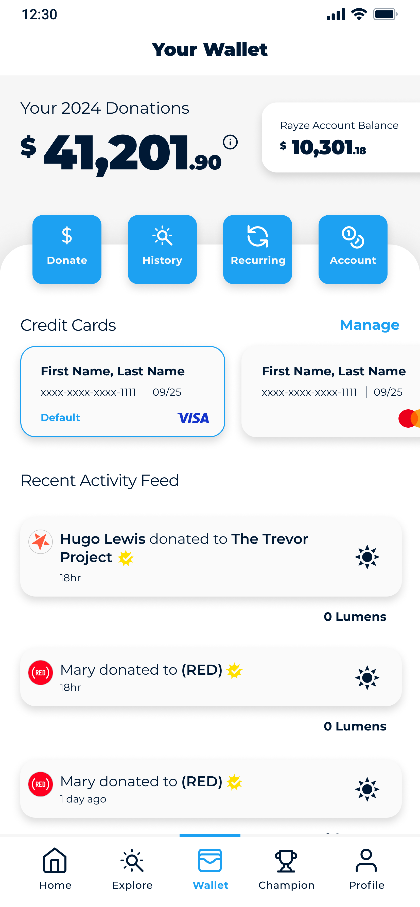
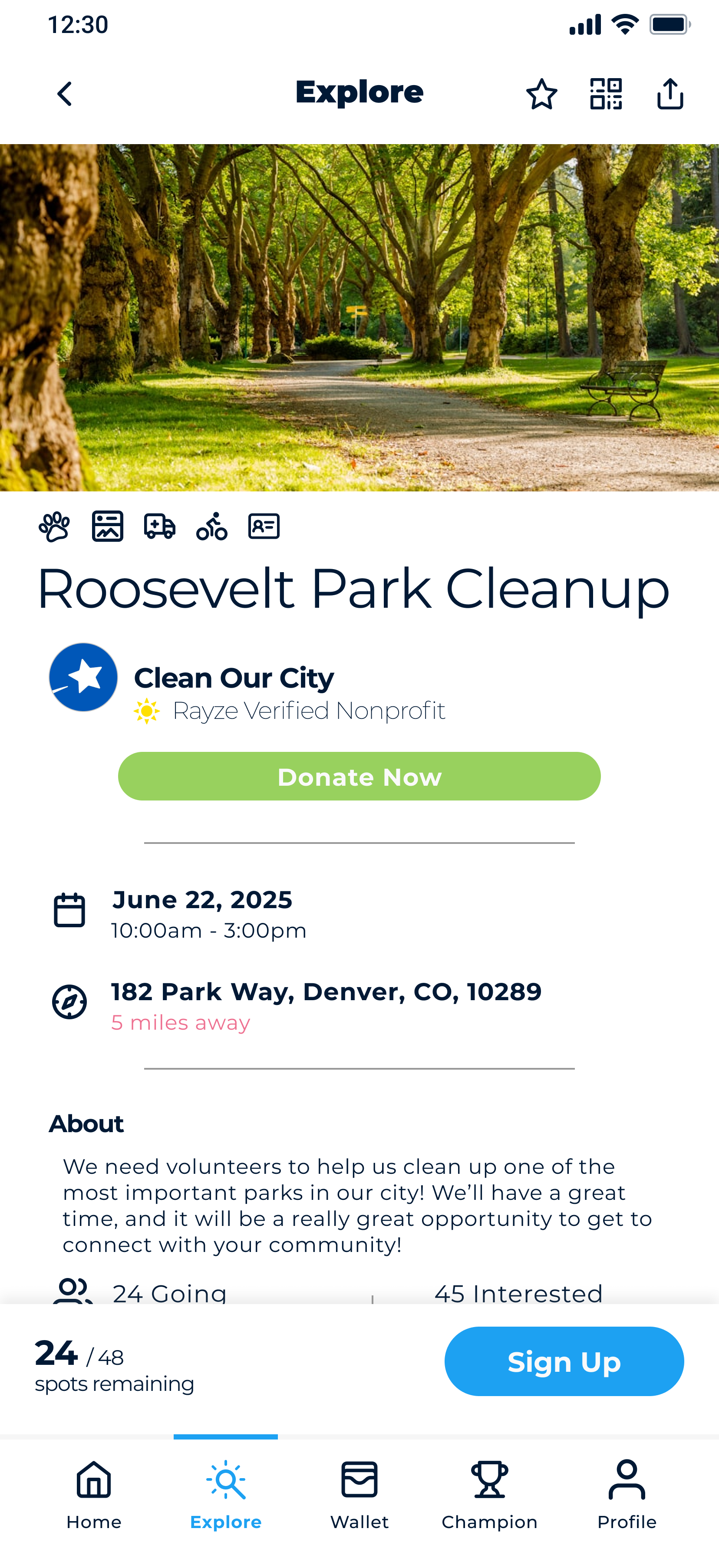
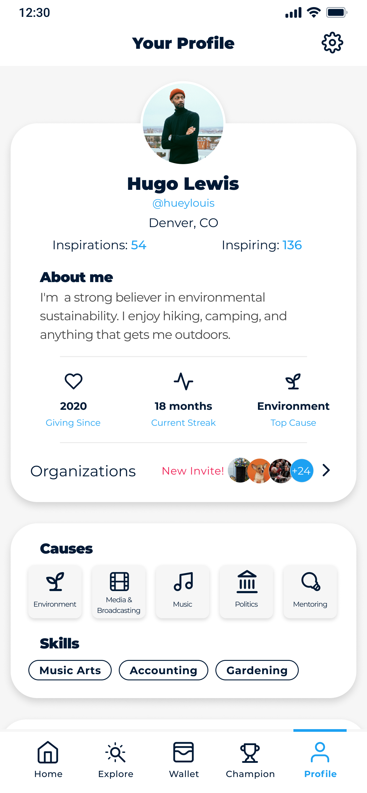
Rayze App Redesign
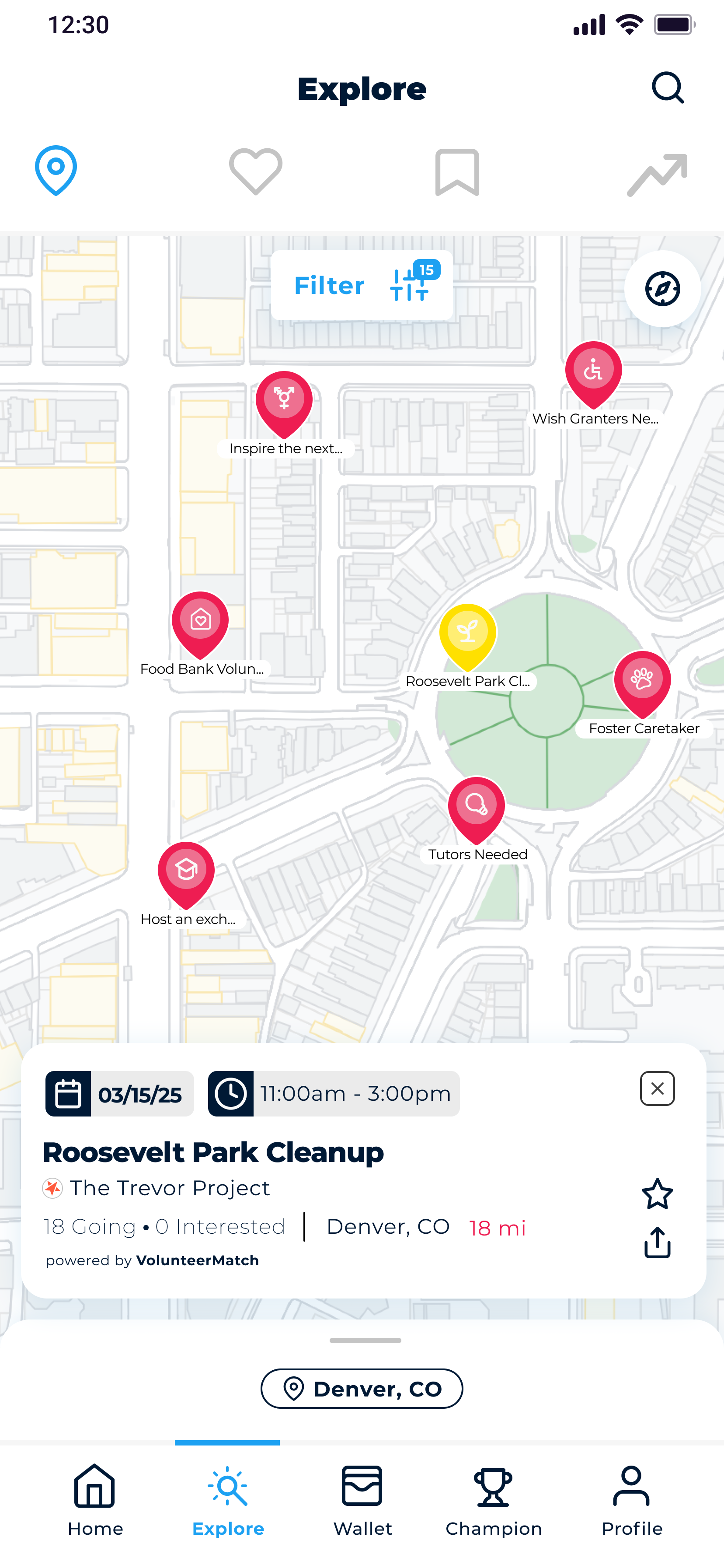
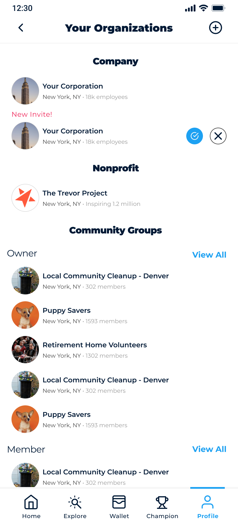
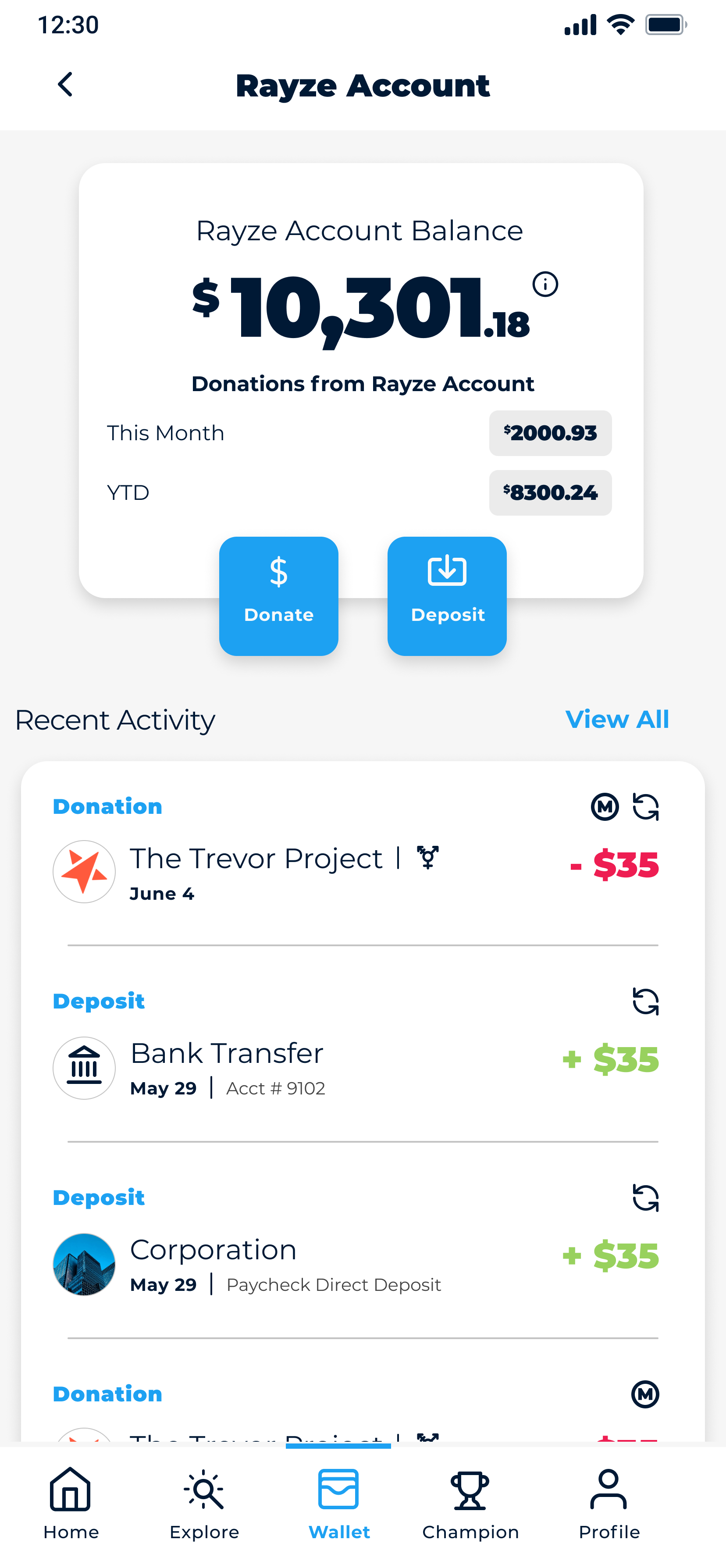
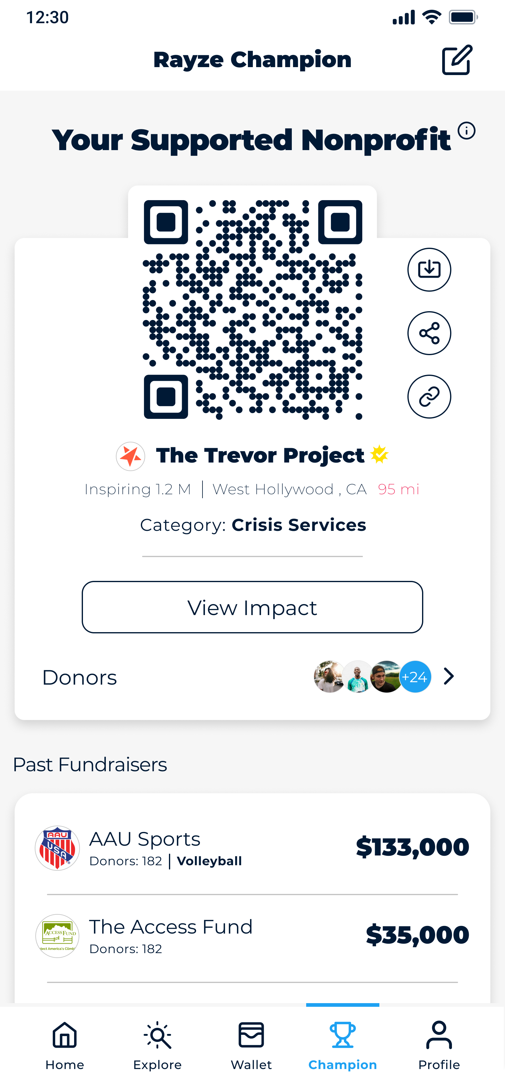
Many things move very quickly at a startup. Usually there is more work to do than hands to do it so you find ways to accomplish multiple things at once. As the sole designer at Rayze I had to manage an overall design refresh of our app while also implementing new features. We wanted to move the design language away from an older and more playful feel and towards a cleaner, and more directed idea. While brainstorming new ideas for our Profile page, I came up with the idea to use a card modal system in our design. It would help keep information heavy pages cleaner, and would offer a more bite size presentation to help keep the user engaged with the app.
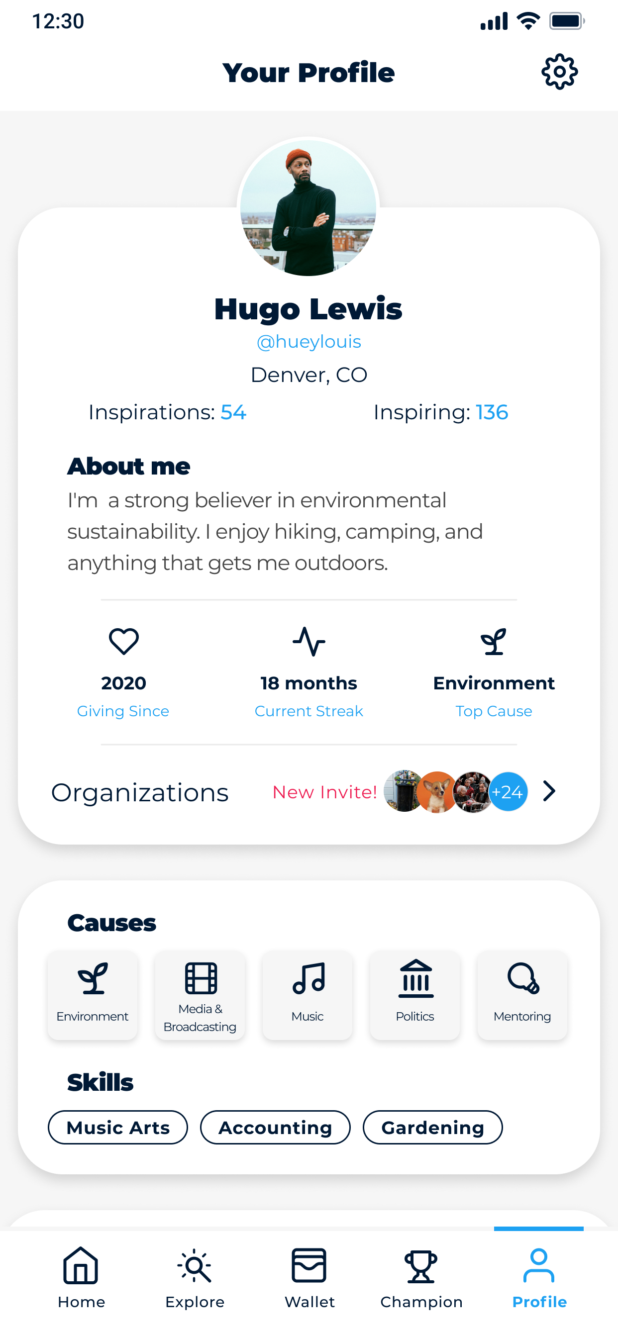
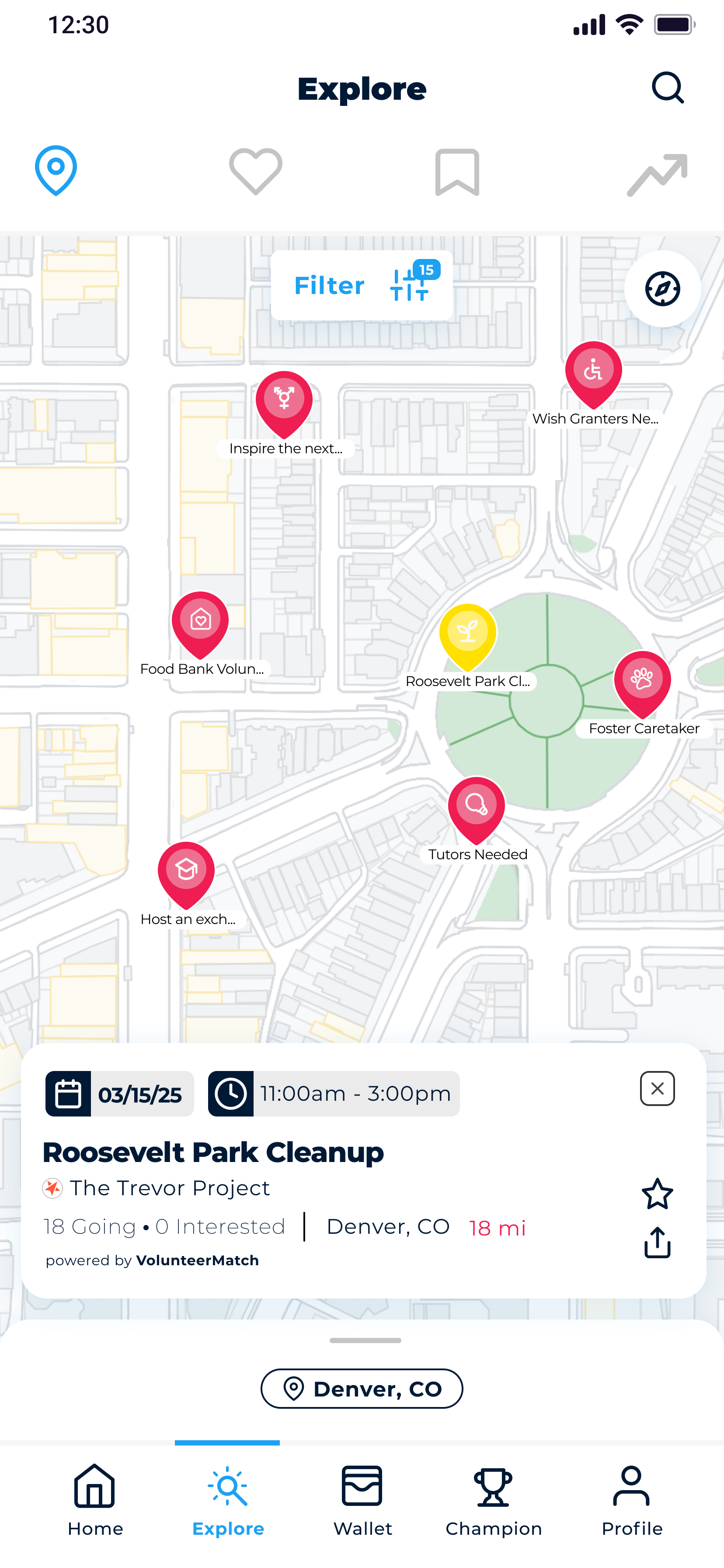
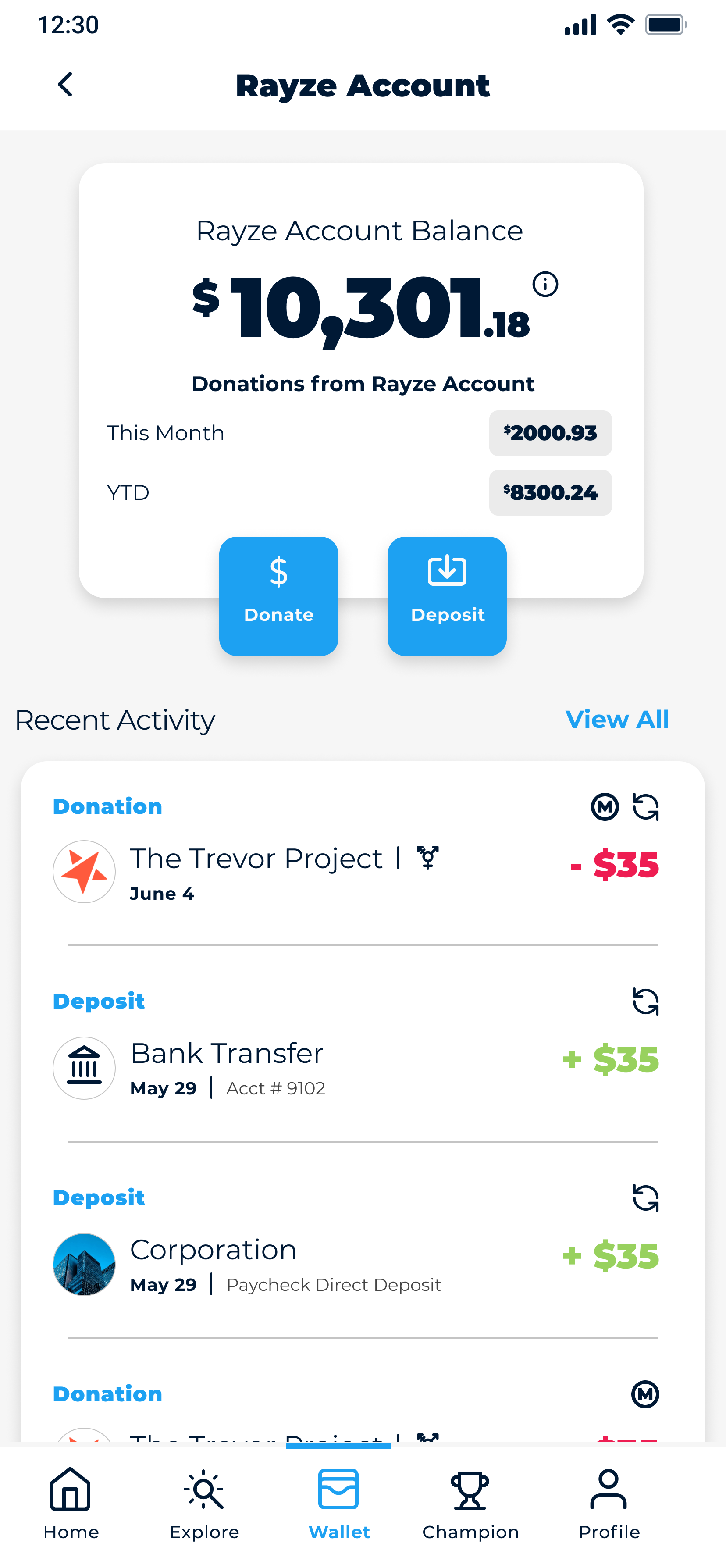
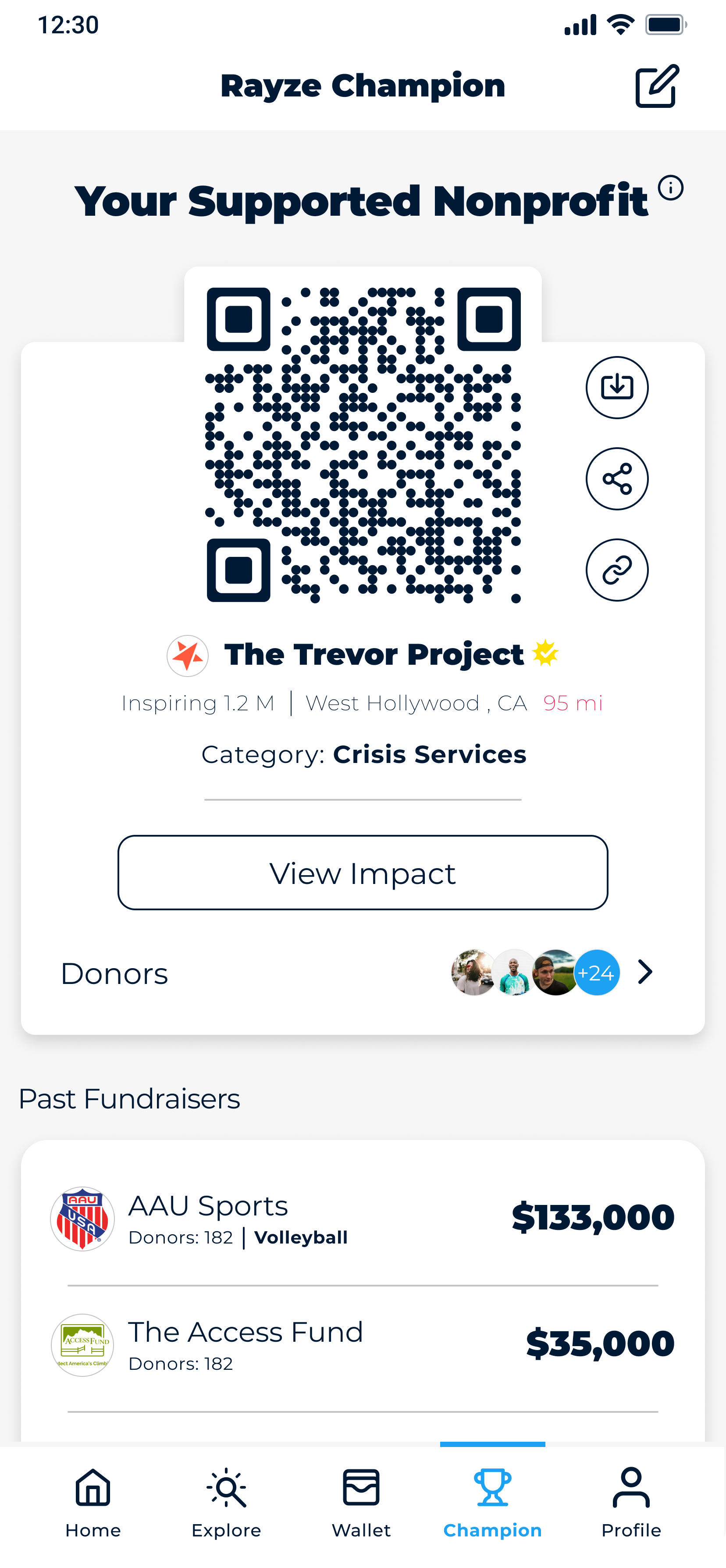
While the original app design was a good starting point it leaned to heavily into the social aspect of the app. We needed a redesign that would allow for more giving and volunteering features. I was working on “growing up” the brand and need the product design to reflect the more grown up and professional branding we had developed.
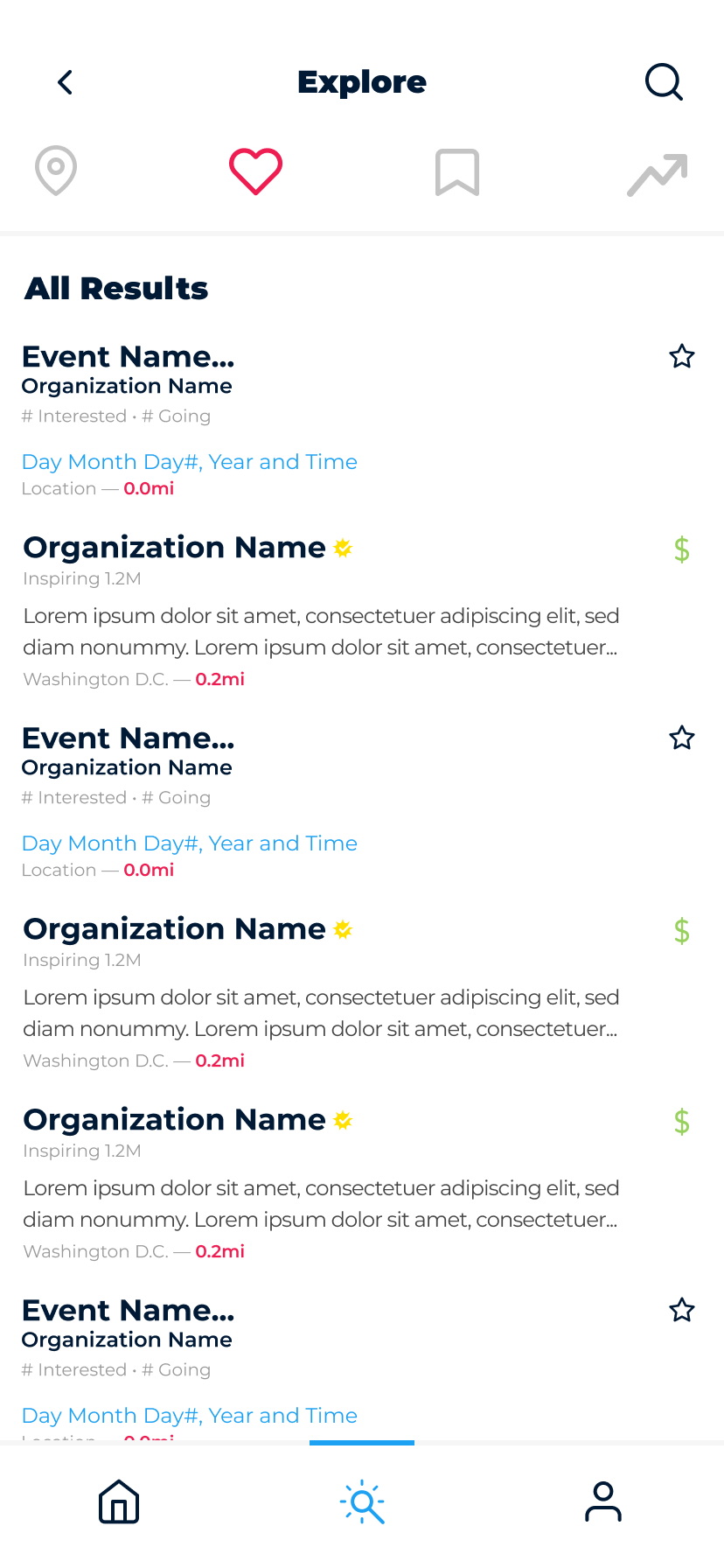
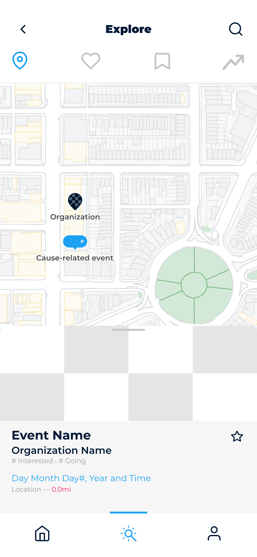
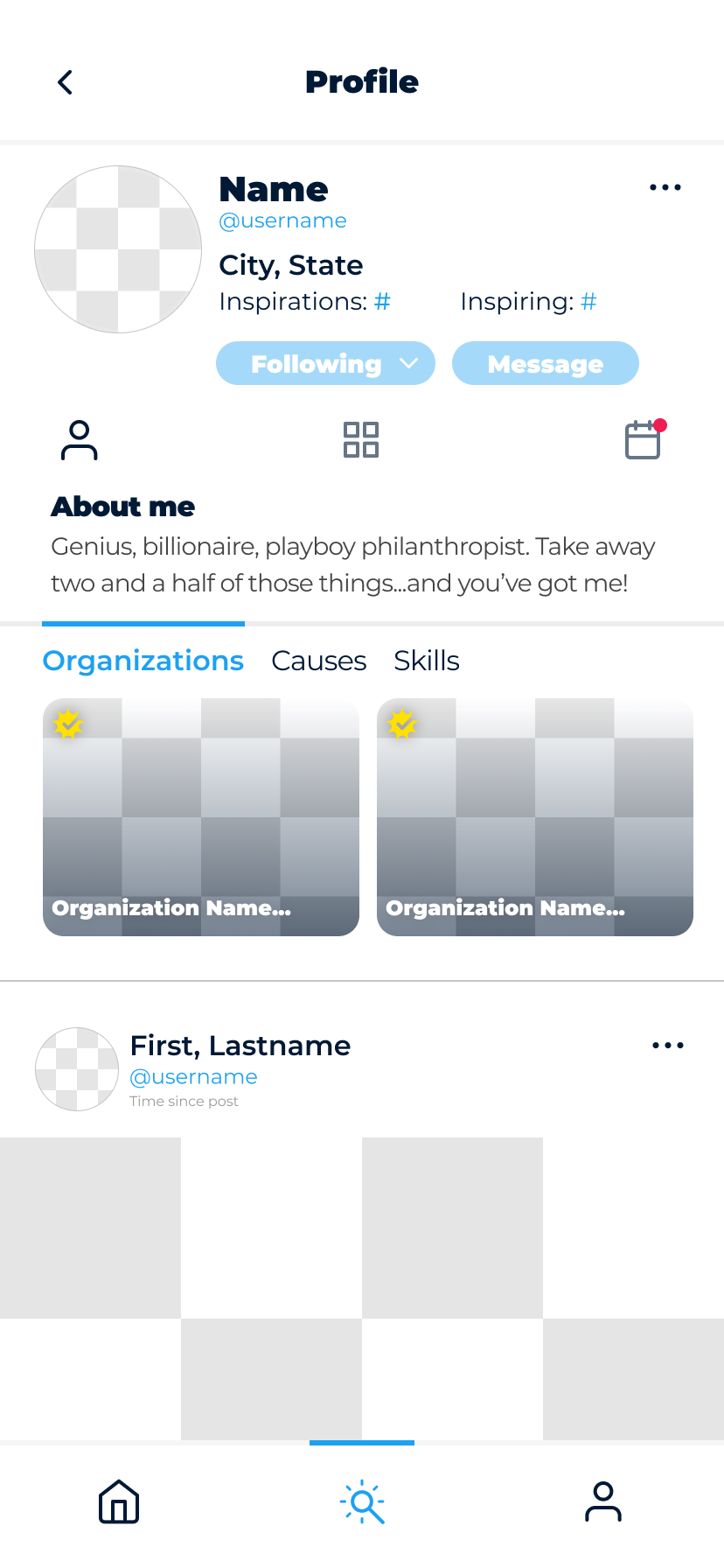
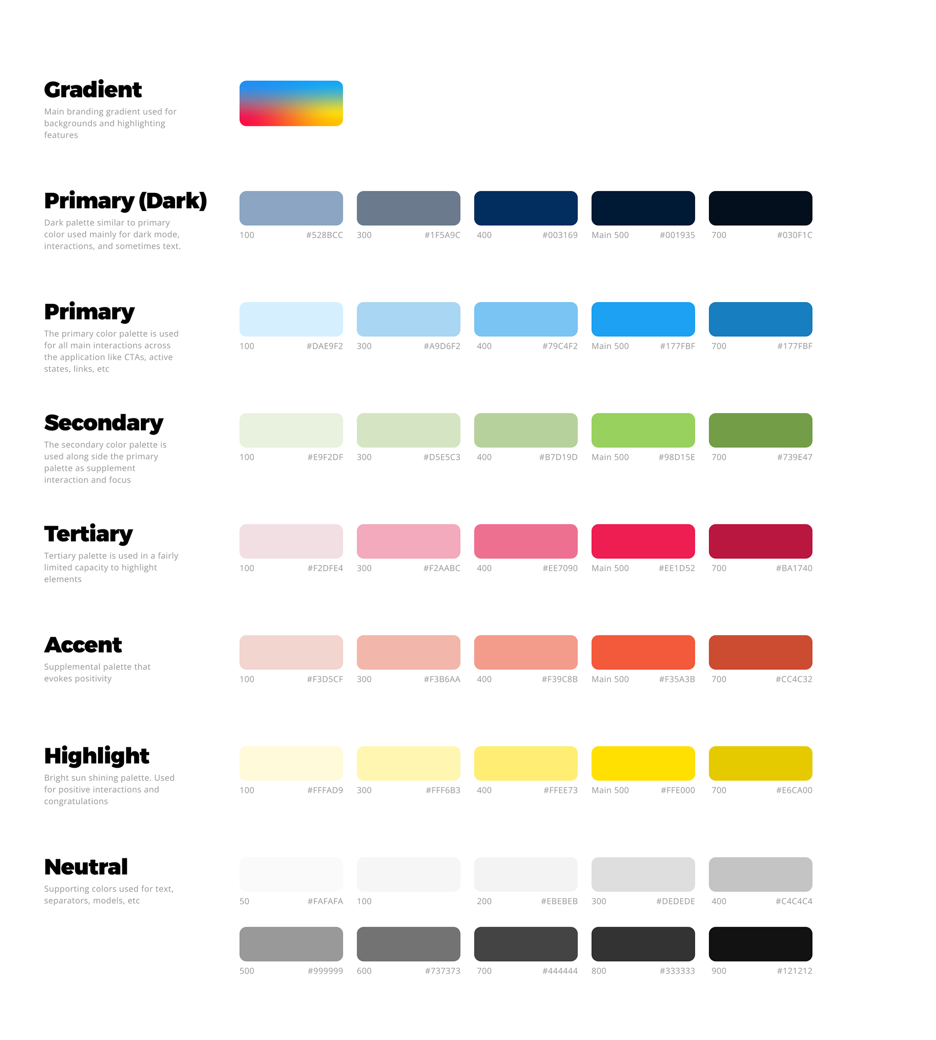
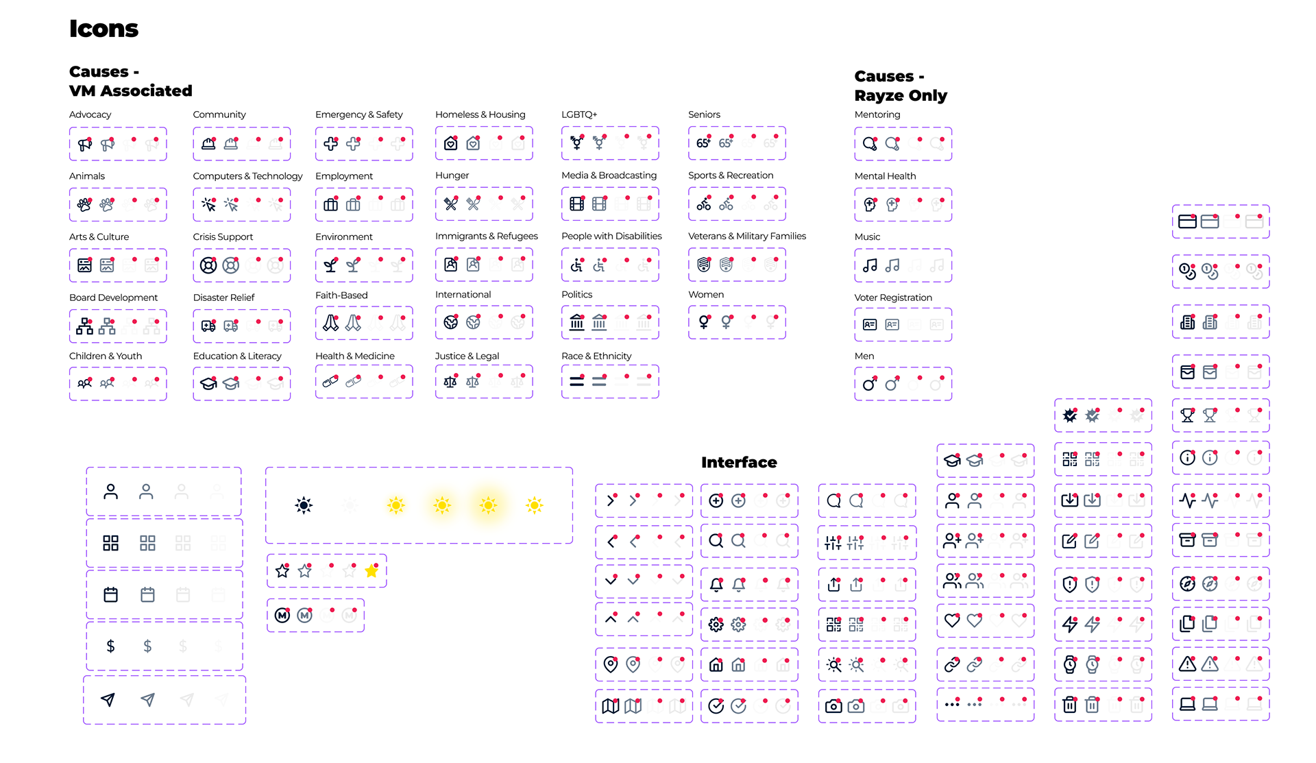
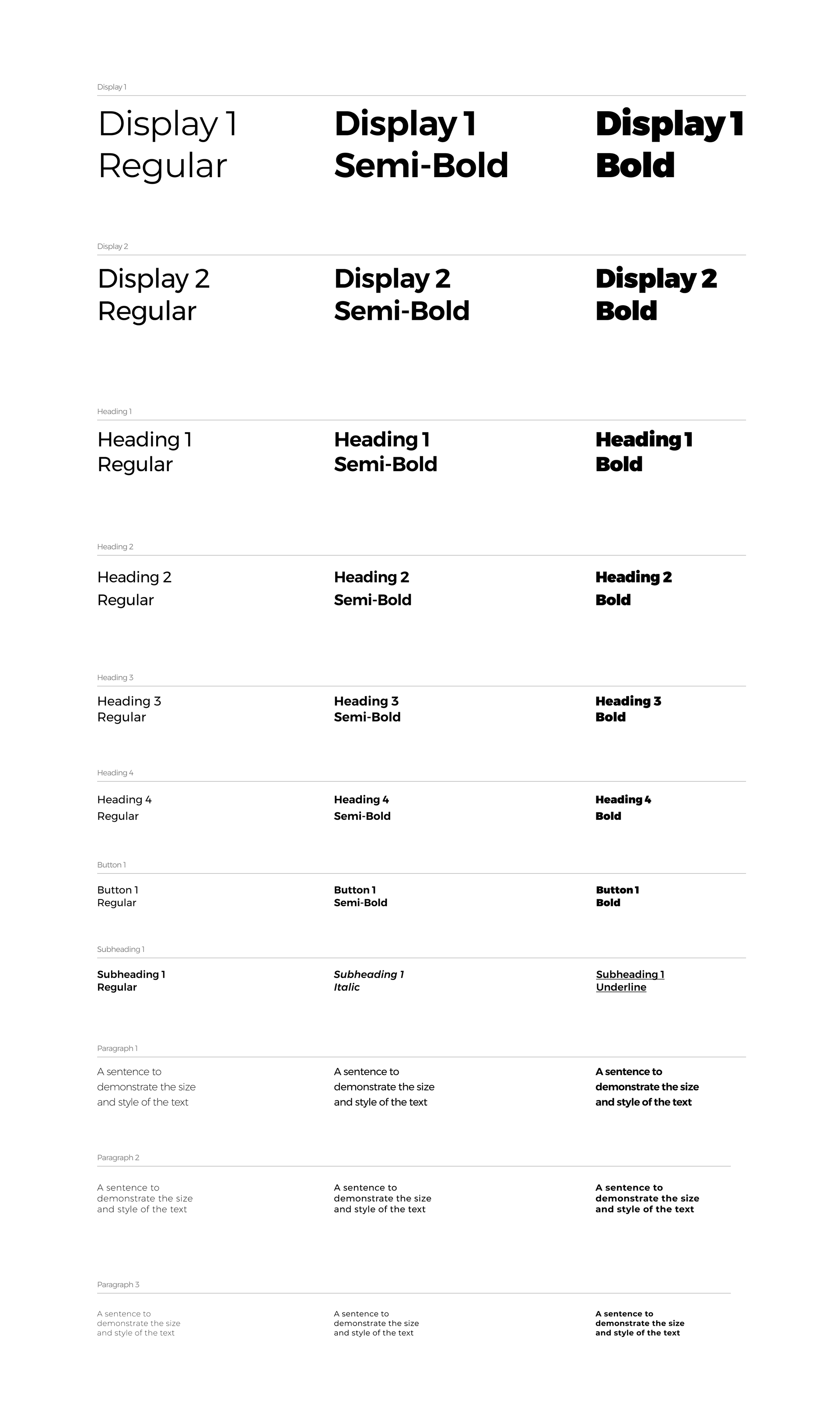
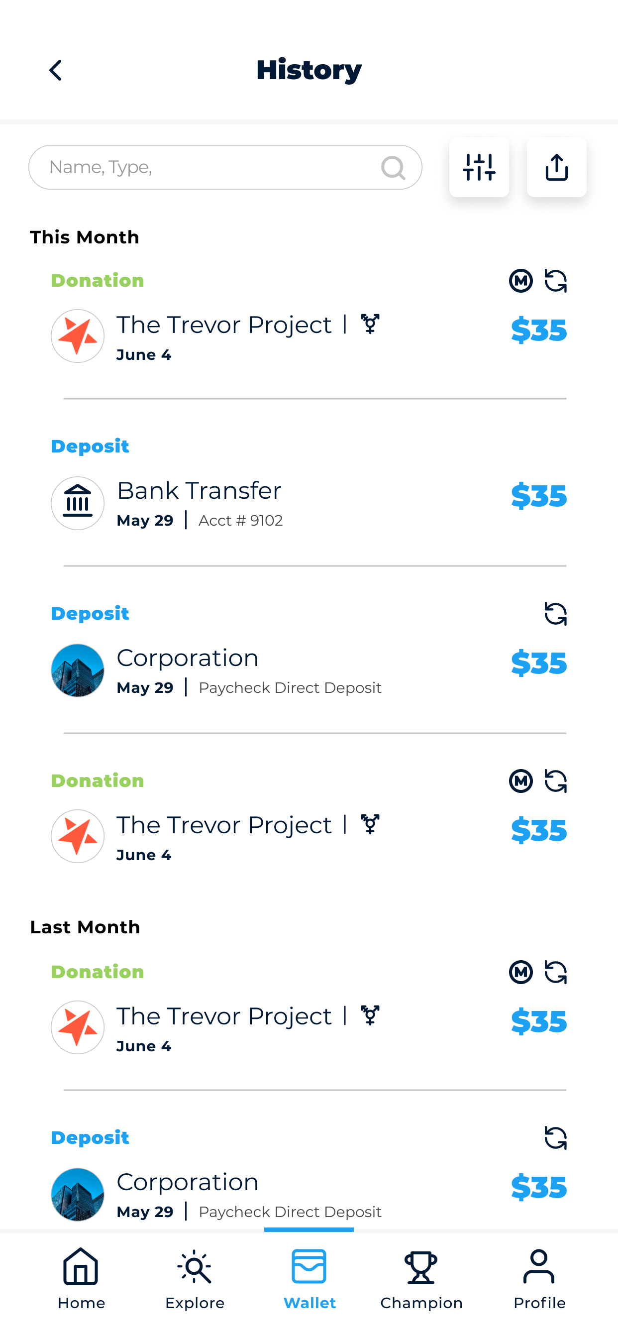
I developed a new design language and component library to reflect a more professional brand, more easily integrate new features, and clarify the user experience.